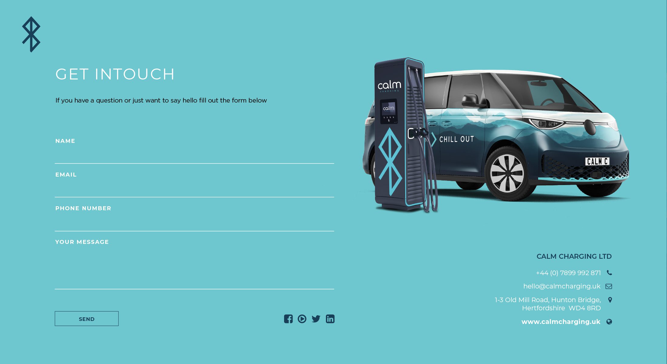
Calm Charging branding
Brand design for a company with a conscience always makes the job more enjoyable.
The team behind Calm Charging has aspirations of making the job of charging Electric vehicles (EVs) a more enjoyable, holistic experience. Working with them has been a pleasure from start to finish.
We’ve worked with members of the team previously so we already had a good understanding of how to work well together. As designers, we also had a strong idea going into the project as to how the branding should look and feel.
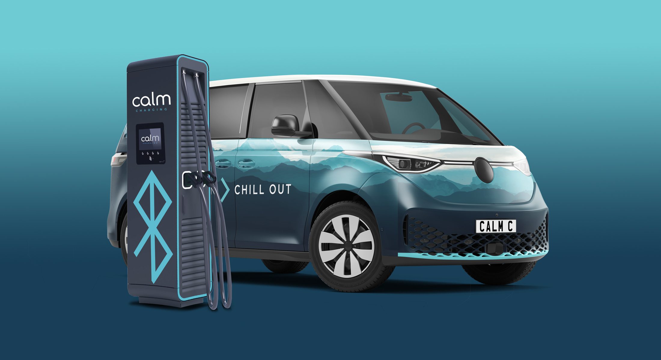
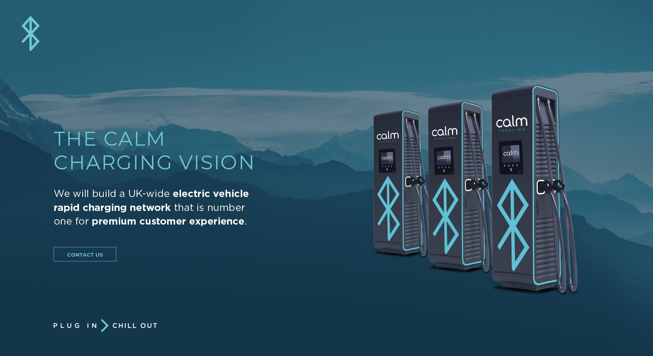
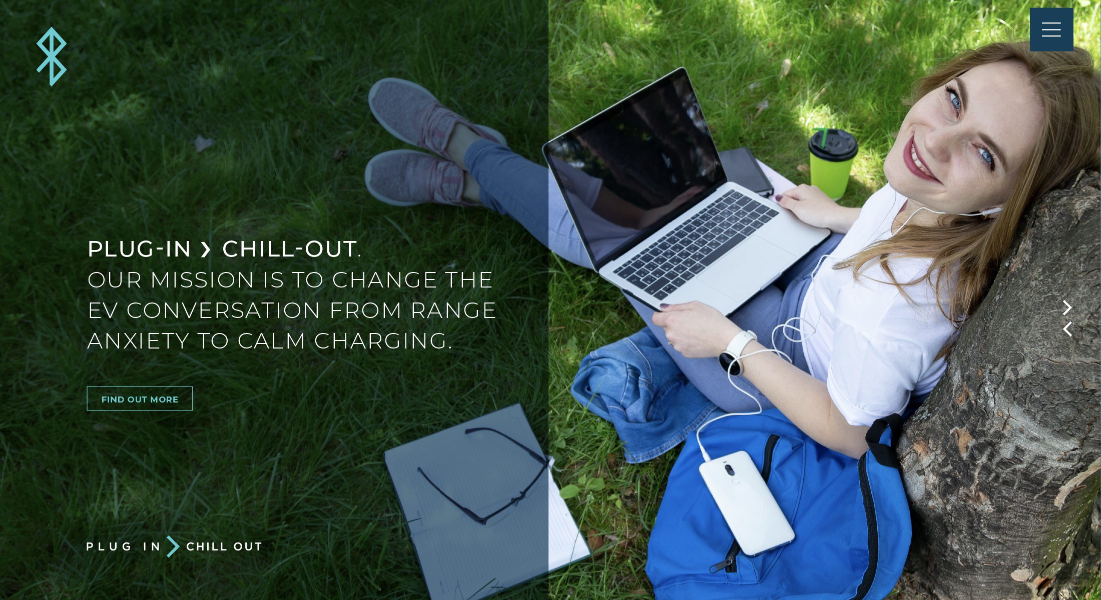
The market surrounding EV charging is becoming more crowded. So, creating a brand that would both fit in and stand out wouldn’t be easy, but we relish a challenge. We worked closely with the team to understand the ethos of the brand. This centred around a person-first approach to charging, whereby drivers could access high-end services and retail experiences while waiting for their car to charge. It’s a very different picture to that which we would normally associate with a stop off at a service station. The branding needed to reflect this.
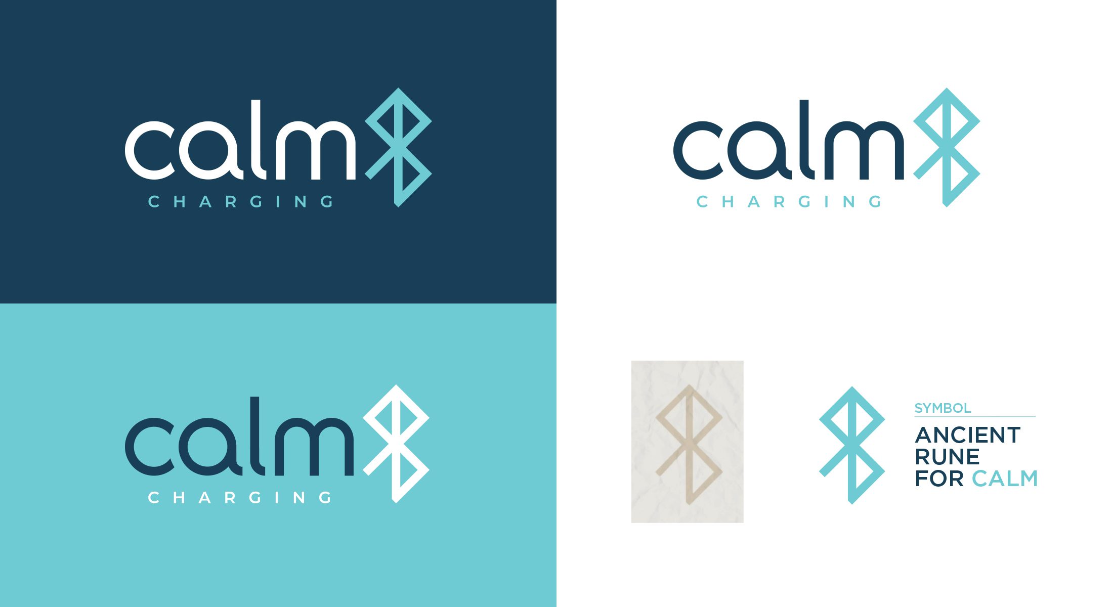
We opted for a nature inspired colour palette. This steered away from the more obvious choices often associated with eco-friendly brands and instead used a more toned down palette of colours. These colour choices can instantly be associated with a sense of space and freedom. The bespoke typeface we created also helped to reflect this feeling. We also felt the font created an air of friendly professionalism, something the client also wanted.
To accompany the brand, we also needed to create an icon. This needed to be able to sit both alongside the brand name or be used independently. Our research into this led to the discovery of the ancient rune symbol for calm which worked perfectly.
We’ve got plenty more work in the pipeline with Calm Charging and we’re excited to be part of this journey with them.
BRAND DESIGN FOR A BRAND NEW EV CHARGING SOLUTION
