Napton Cidery branding redesign
The branding redesign project for Napton Cidery began when this lovely family of cider makers asked us for a brand overhaul. They asked us to create something that is more up-to-date, has a more personal touch and that appeals to a much wider demographic.
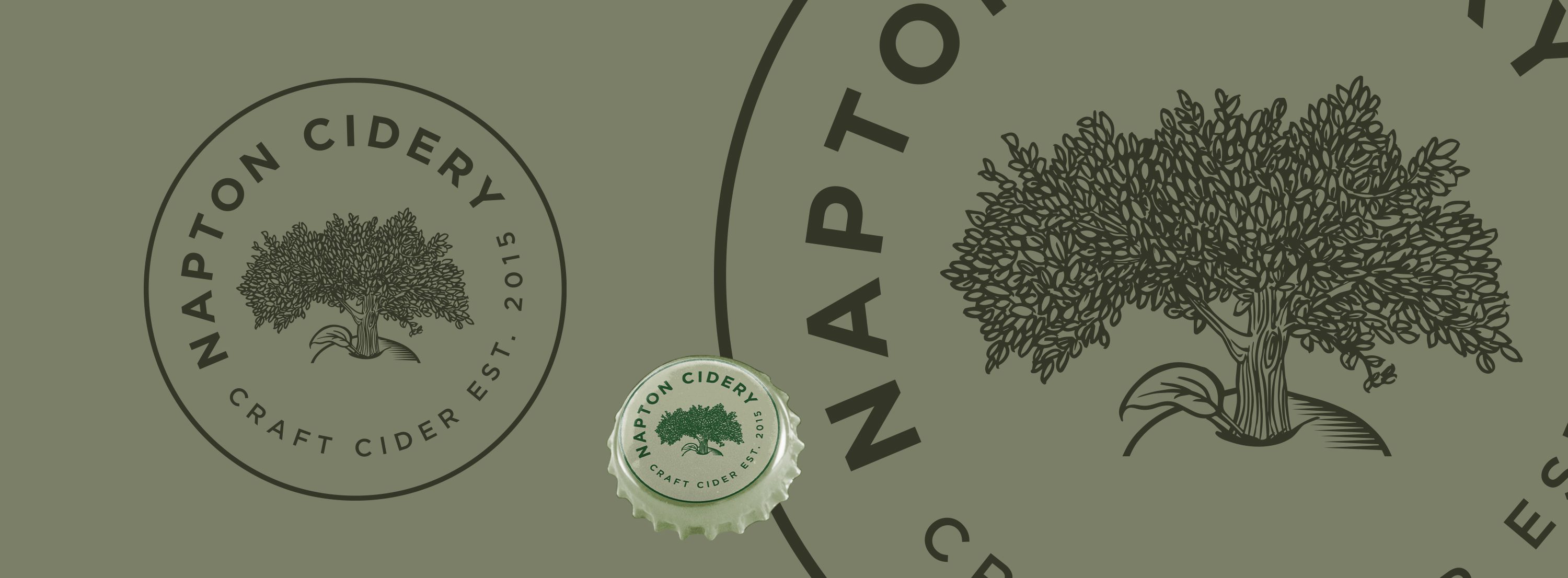
Key to Napton Cidery’s business is supporting sustainable British farming. They do this by sourcing apples from small orchards across the UK to create their unique and delicious cider. They wanted to echo this dedication to homegrown talent in the brand so asked for the image of a tree that sits outside their house and next to the cidery to be used as our starting point.
The logo image is hand drawn, using a photograph as our base so it is completely accurate. The tree is also well known in the local area so the image needed to be right! It took many hours to perfect the illustration and we’re delighted with the final result.
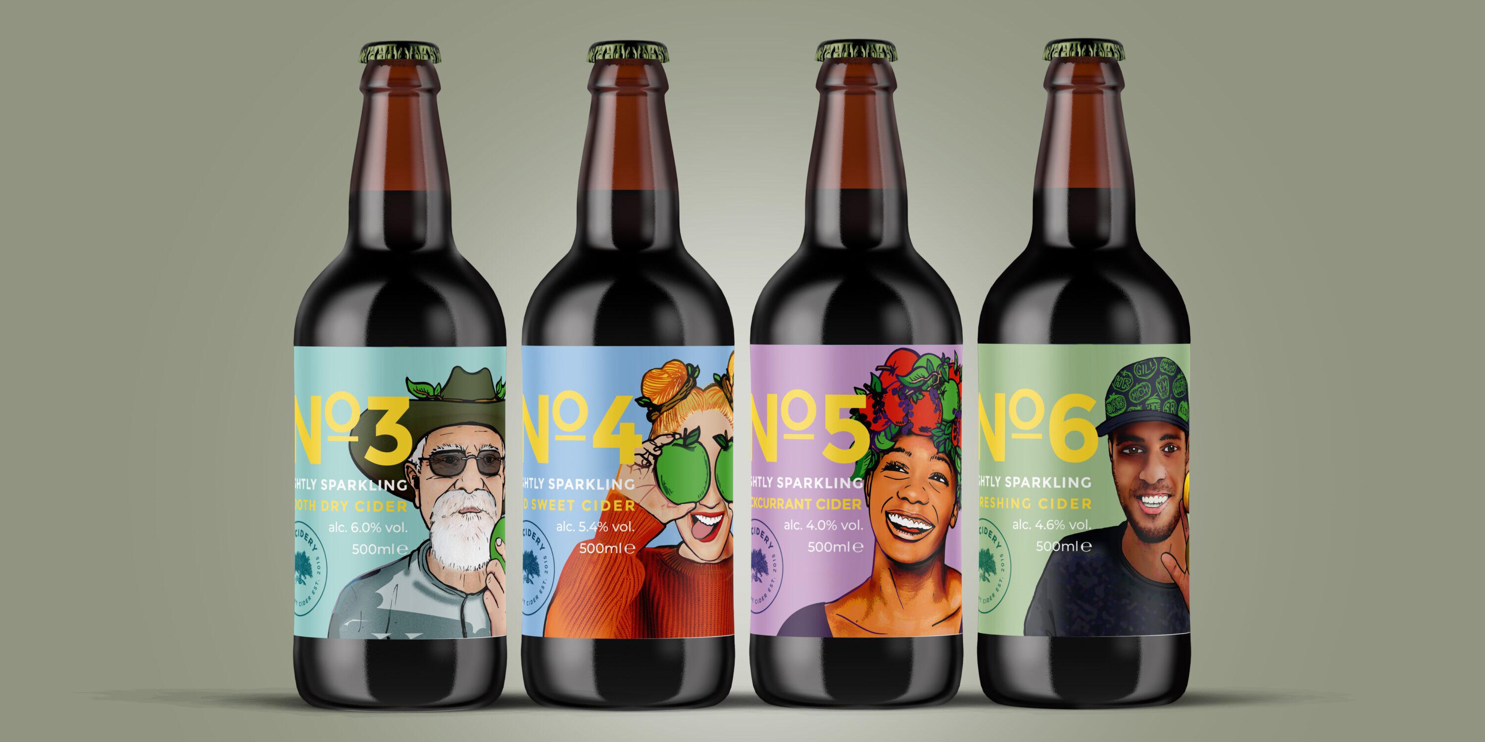
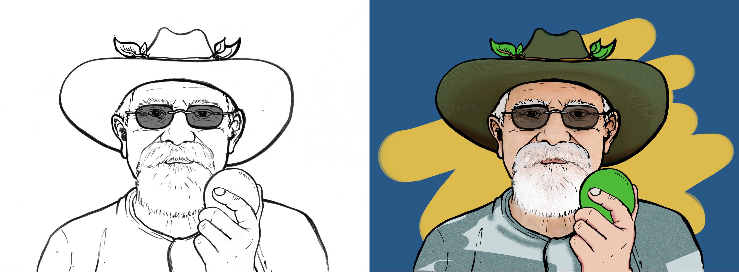
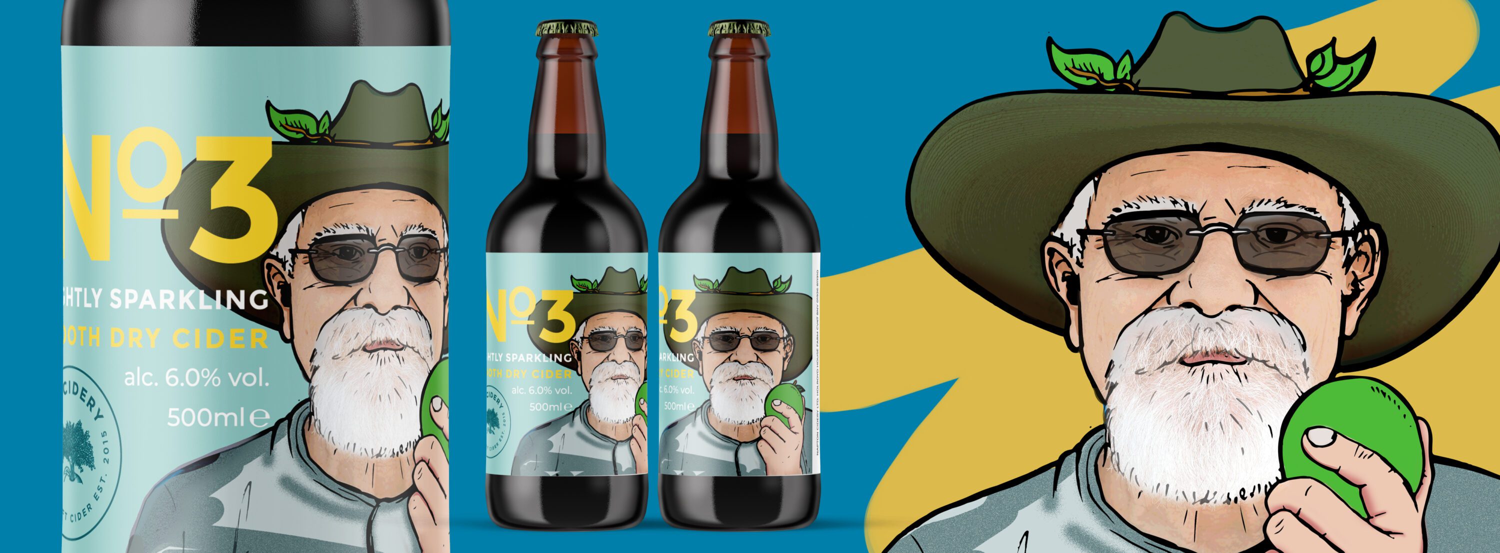
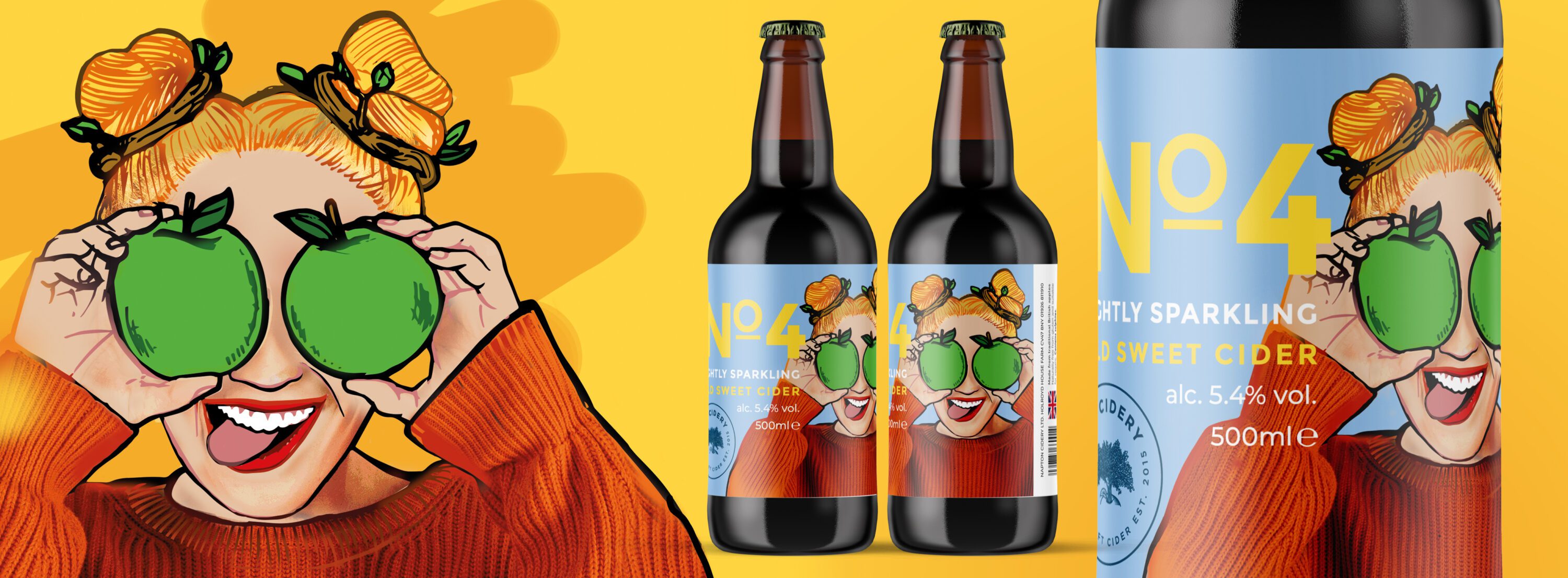
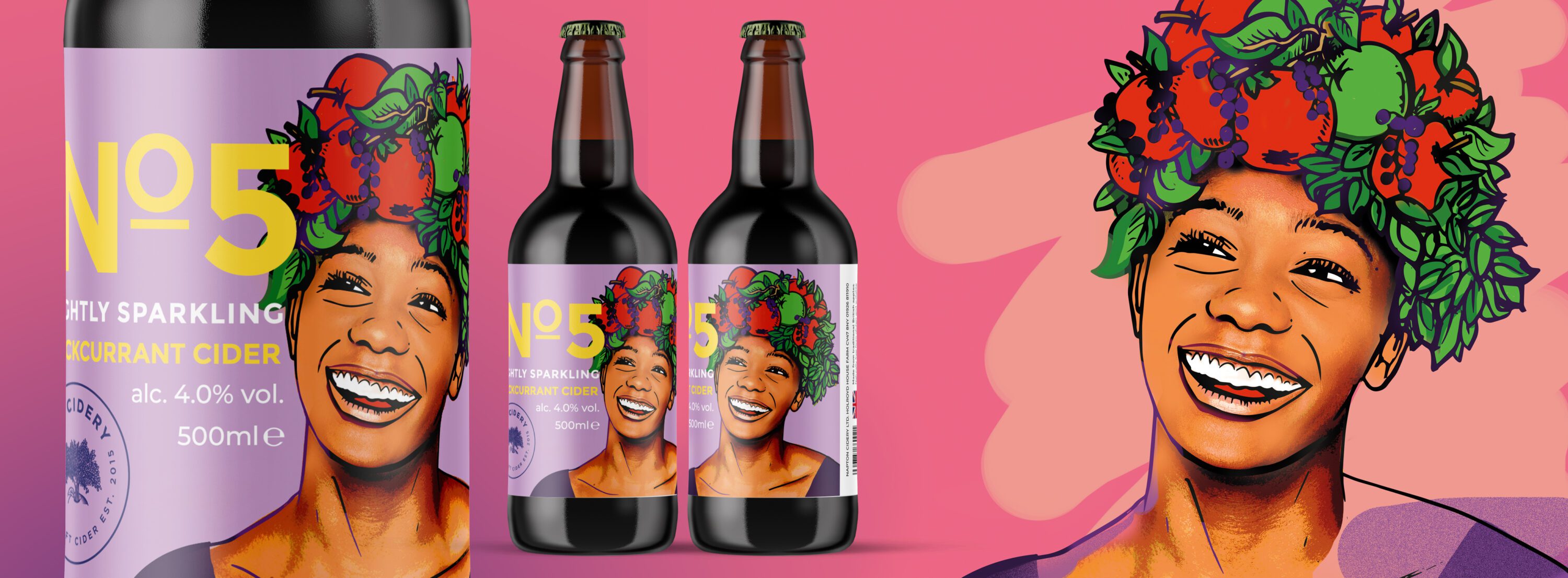
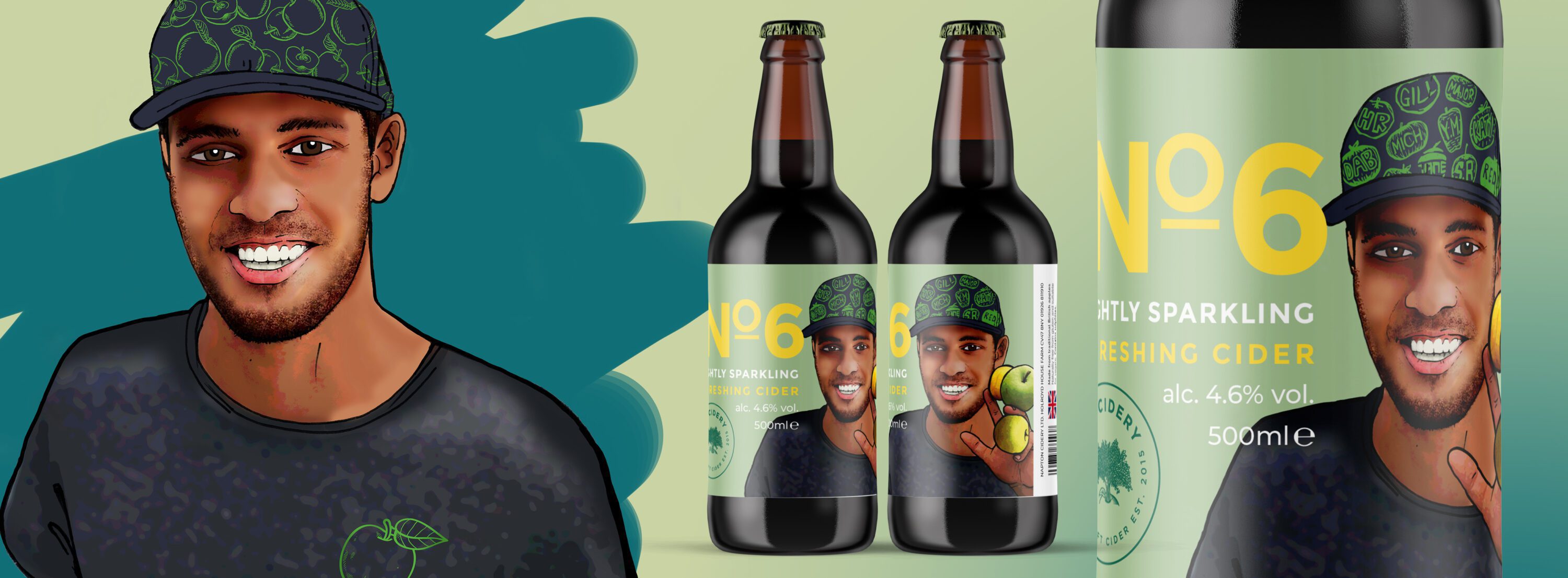
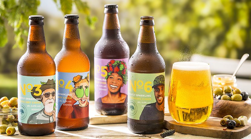
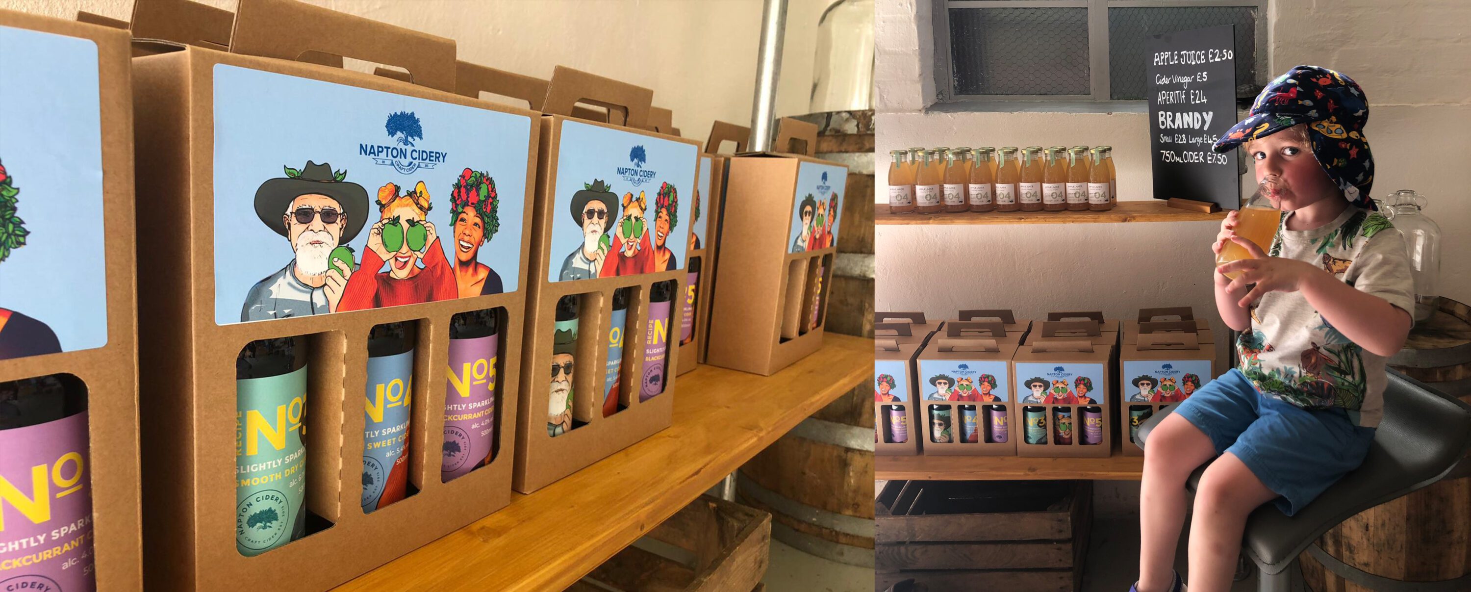
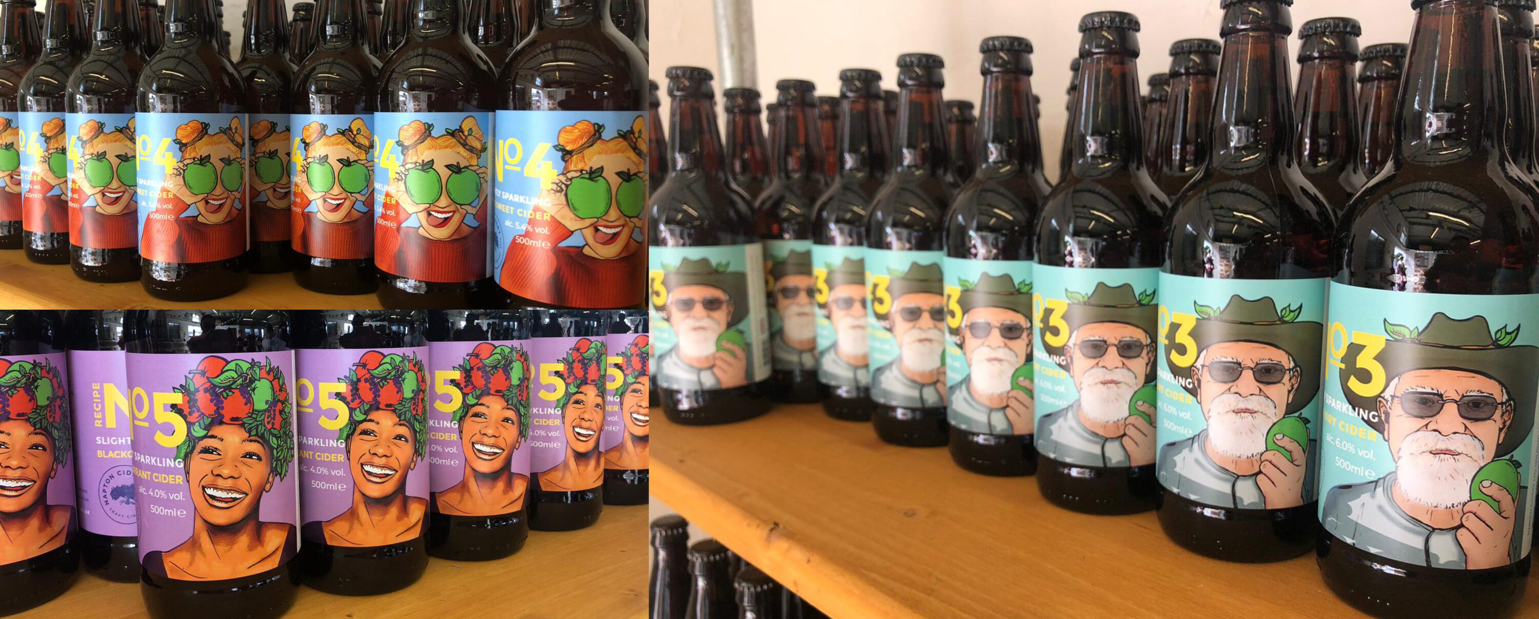
The logo emblem works well across a range of uses but, perhaps most importantly, is perfectly suited to the labels we also designed. The new labels are key to the overhaul as they reinforce the updated identity. For each label design we created a bespoke illustration. Our client had clear ideas around the character they wanted featured on each label. We explored various styles until we created one perfect for the brand and rolled this out across all flavours.
Now offering craft and fruit ciders, apple juice and cider vinegar, the company has gone from strength to strength. The family continues to develop new products and we’ve been delighted to sample many of them along the way.
You can read more about the bespoke illustrations we’ve created for the cider labels here
www.naptoncidery.co.uk
Branding redesign for a family of cider makers
