
Noon Line Brewing Co packaging design
The packaging design for Noon Line Brewing Co’s exciting new range of craft beers was a hugely rewarding project. We were involved from the brands early stages. This gave us lots of creative freedom when it came to the label designs. We learned that the brand’s name came from a line carved into the steps of the Noon Line store. When this line is hit by the shadow of the step’s bannister it signals midday, or as we like to call it, ‘Drink O’Clock’.
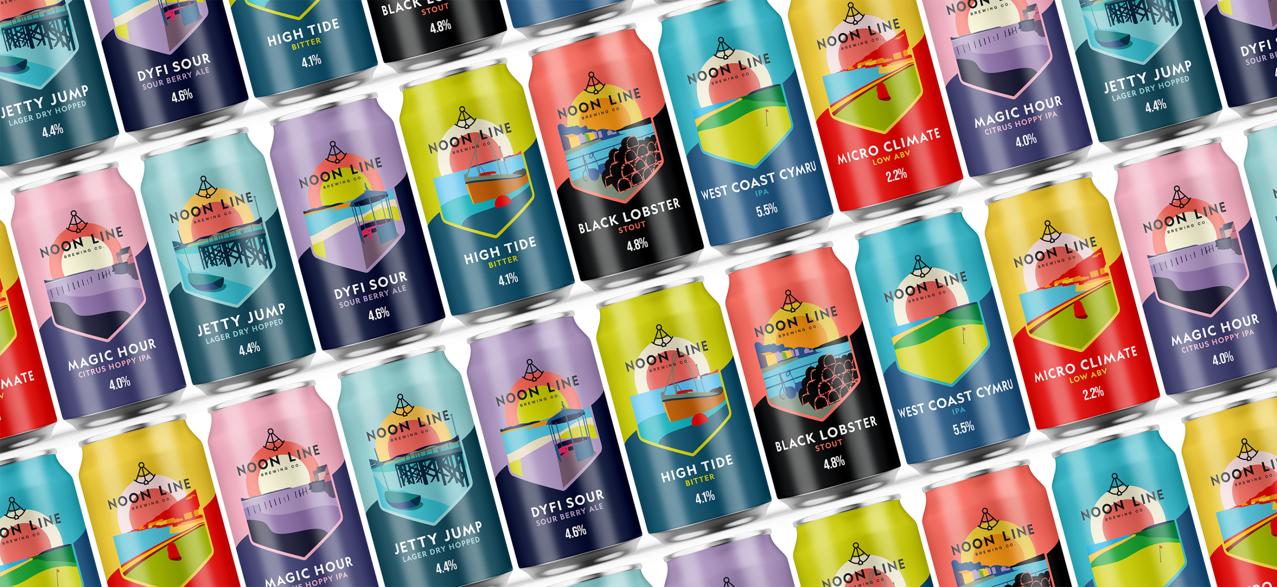
Postcards with a difference
The concept behind the designs was for them to take the form of ‘postcards on a can’. This is to celebrate the area of Aberdyfi where the beers would be sold and also to help market them as souvenirs of time spent there. In order to really capture what people loved about the area, we spent the weekend there. We soaked up the atmosphere, got to know the sites and, most importantly, captured the images that the packaging designs would develop from. To help us in our task we were given the drinks’ names, again inspired by local landmarks and quirks of the area. This too informed the design styles. We then carefully recreated the scenes we captured in an illustrative style that gave enough detail for them to be recognisable but in a contemporary way that meant the designs wouldn’t date as the brand evolves.
One of the key points to the brief was that the colour palette for labels was to be bright and eye-catching. This was to ensure they were on trend and stood out against competitors. This also celebrates one of the founders names, which happened to be Rainbow!
We spent a lot of time honing the colour palettes so they worked individually but also as a set. Another key element of the designs was the use of the angled line which separates the two colours on each can and is the exact angle of the Noon Line itself.
Time for cocktails too!
Once we’d honed the designs for the beer cans we then rolled out a similar, more simplistic style for the company’s range of cocktails. This time, we kept a circle element to symbolise ‘noon’. We also opted for a striking black and pink palette, the pink being taken from the Noon Line shop, and this was complemented with gold foil detail for a luxury feel.
In addition to creating the can designs we’ve also created designs for beer mats, clothing, flyers, deck chairs, floor decals, shop front displays, shop signage and more.
We had great fun creating these designs and we’re really happy with the finished product. The client too is delighted and we’ve received lots of good feedback from others in the industry and customers alike.
You can take a look at the range of drinks on Noon Line’s own website which is coming soon www.noonline.co.uk
To find out how we might be able to support your label or packaging design project, please do get in touch
Packaging design for craft brewery


