Ridge & Furrow brand design
The brand design for this revolutionary community project in Warwickshire is an emblem of everything it wants to achieve.
The aim of Ridge and Furrow is to be a flagship for Sustainable British Community design. It will become a small, low carbon housing development. This will be surrounded by a community-run farm landscape for food production and this is to be integrated with work units, an eco education centre and accommodation.
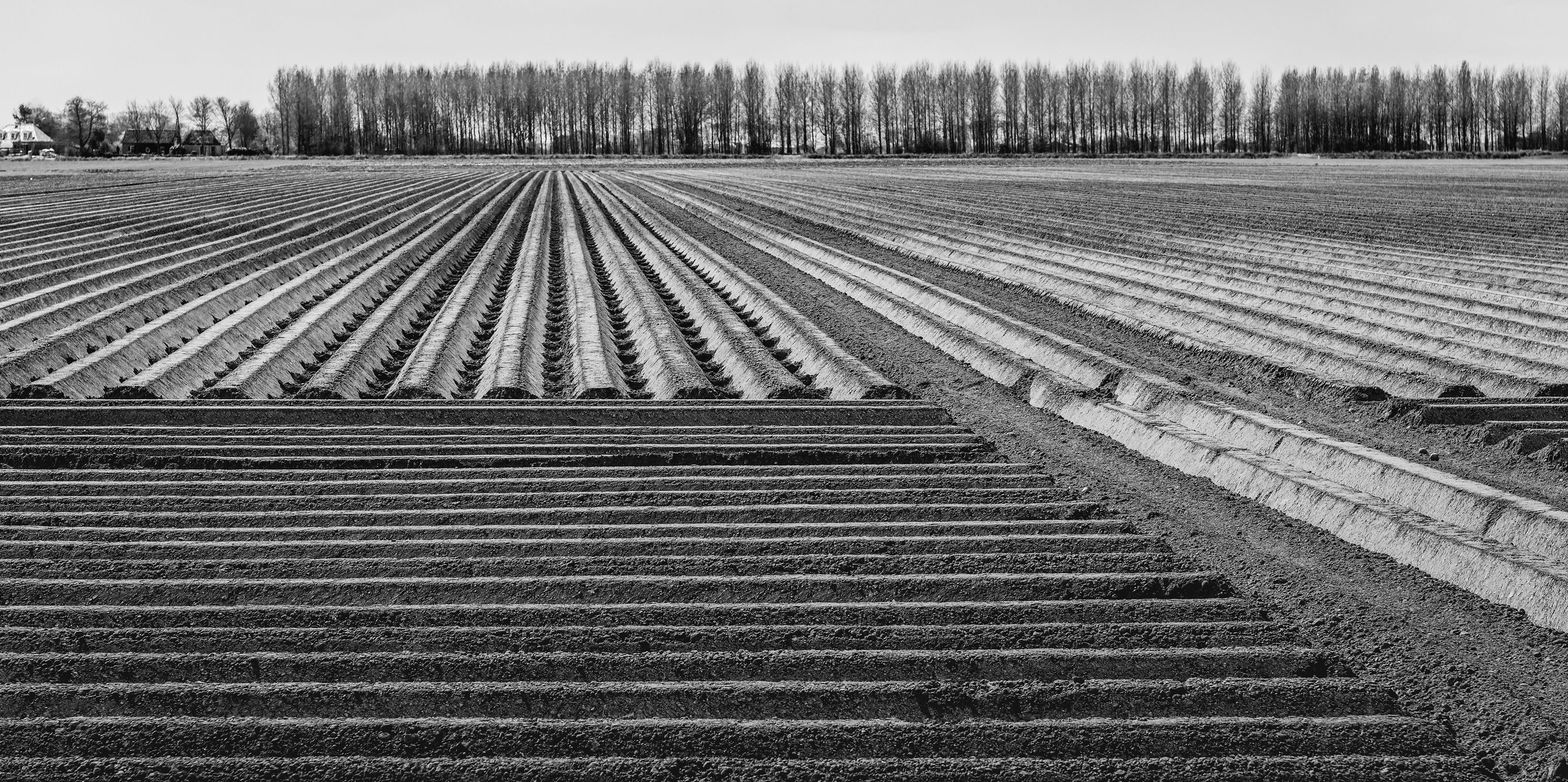
The brand design for this project was inspired by the archeological pattern of the land it will be built on. The is called ridge and furrow. This, of course, is also the inspiration for the scheme’s name.
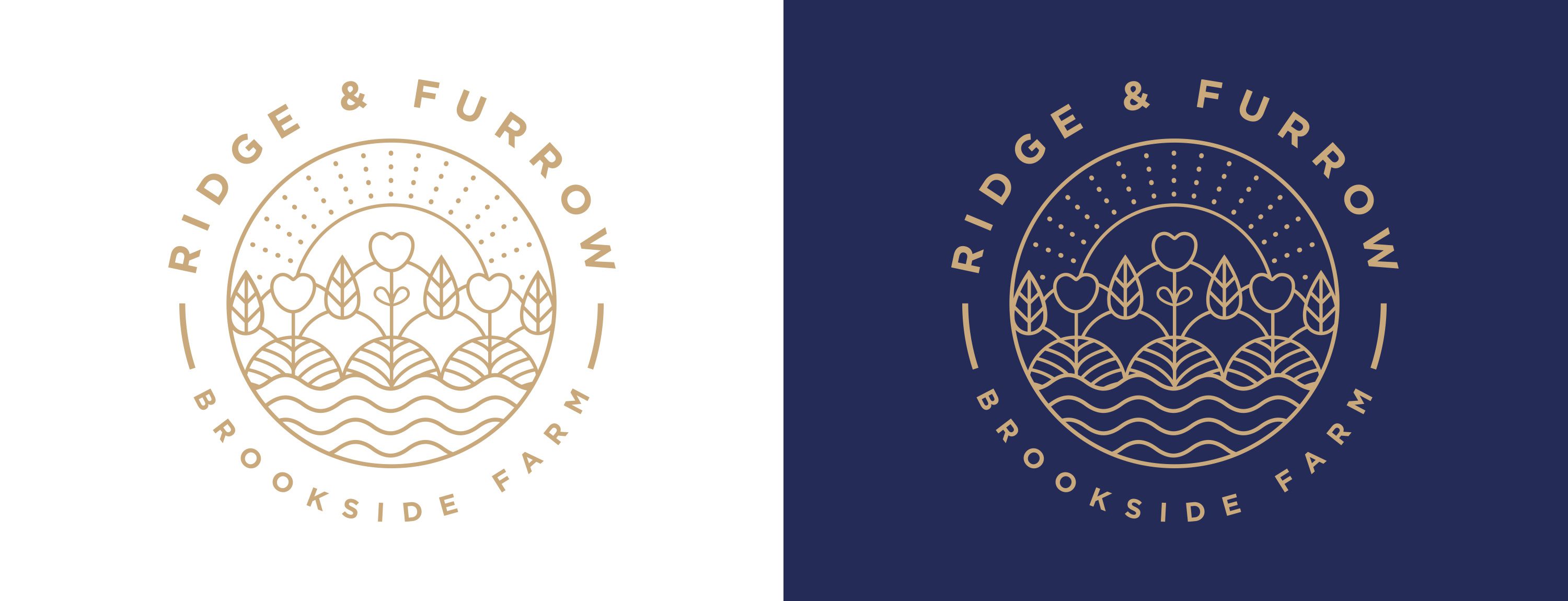
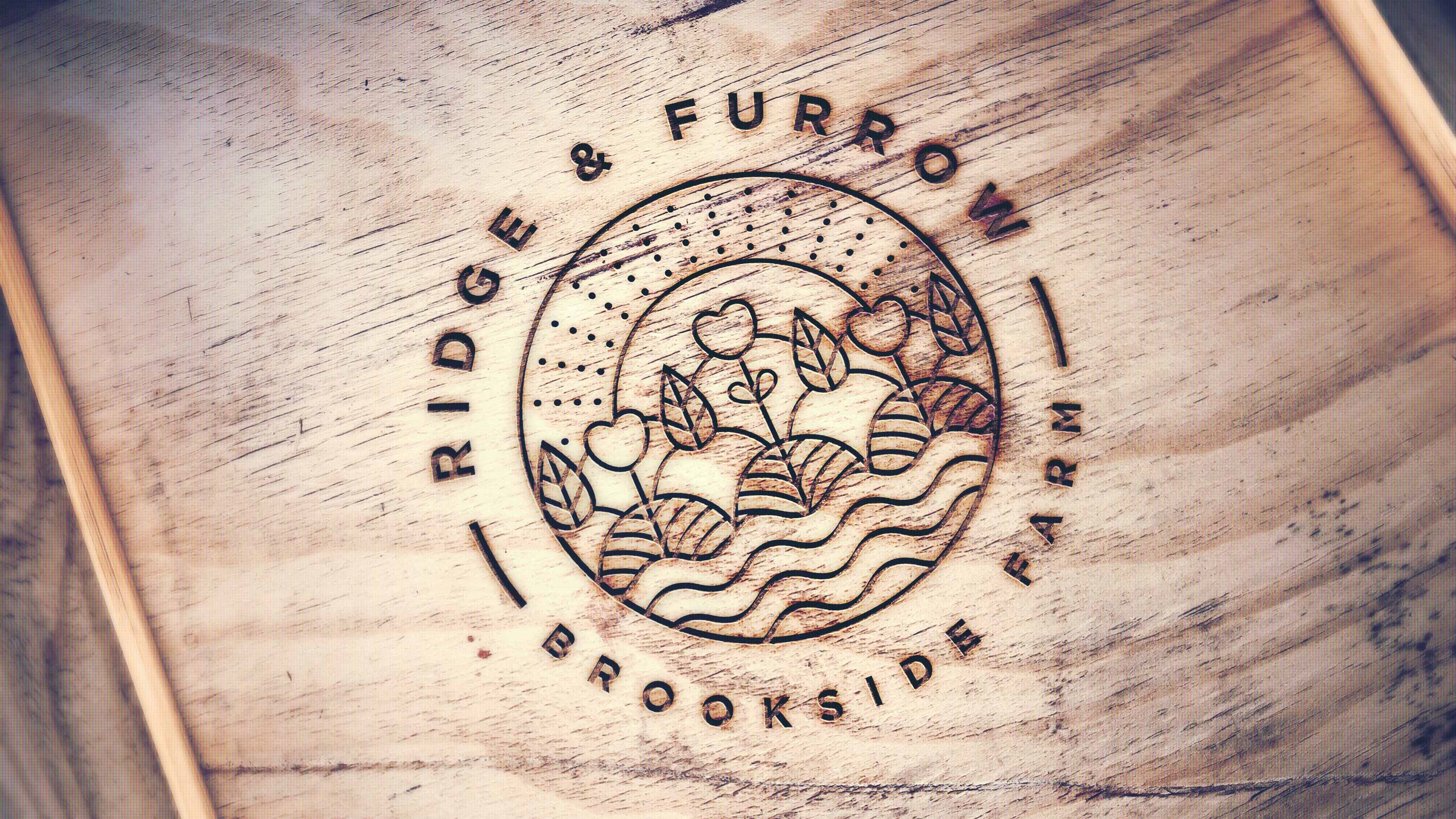
We opted for a contemporary illustration style that is clean and beautiful. The ridge pattern was used as a starting point and the illustration was built up from there. Elements inspired by the organic side of the project are used, as are simple lines to create a complex picture.
We decided to use two distinct colour palettes, a bright and light gold on white and a classic blue and gold combination to give it versatility.
Brand design for local eco-community


